Graphs and graphing
A graph is a pictorial representation of a set of data. These data can be of two distinct types: continuous or discontinuous. An example of continuous data would be temperature readings taken during a single day. A person may choose to observe and record the temperature once every hour, once every half hour, or on some other schedule. But temperature is a continuous phenomenon. One can read a temperature at any instant of any day.
Other data are discontinuous. Suppose you want to record the number of children in a class who are right-handed or left-handed. Children can be either right-handed or left-handed. Of course, some children might be ambidextrous, that is, capable of using either hand. However, those three choices are the only possibilities. They constitute three distinct categories and are regarded, therefore, as discontinuous data.
Representations of discontinuous data
Bar graphs. Graphs that depict discontinuous data are common in the daily newspaper. Those graphs usually take one of three forms: bar graphs, picture graphs, or circle (pie) graphs. In a bar graph, the distinct categories to be represented are shown on the horizontal axis. For example, three regions might be marked off for "right-handed students," "lefthanded students," and "ambidextrous students." The number of cases belonging to each category, then, are displayed on the vertical axis. If the number of students in each category were 17, 19, and 1, for example, one would draw a bar extending 17 units above the right-handed students category and a second bar extending 19 units above the left-handed category. A third bar—extending 1 unit above the ambidextrous category—would complete the graph.
Picture graphs. A picture graph is similar to a bar graph except some type of pictorial symbol is used to represent the variable being counted. The graph described above could be redrawn using 17 student figures for the right-handed category, 19 student figures for the left-handed category, and 1 student figure for the ambidextrous category.
Words to Know
Continuous data: A collection of facts that have an infinite number of values.
Data: Factual information, often expressed in numerical terms.
Discontinuous data: A collection of facts that have only a certain number of values.
Function: A relationship between two variables such that for a given value of either there is one discrete value for the second variable.
Variable: A number that can take on a variety of numerical values.
Representing divisions of a whole. Circle, or pie, graphs are generally used to show how some whole quantity is subdivided among various categories. For example, the state government might want to show that 35 percent of its annual income comes from income taxes, 40 percent from sales taxes, 10 percent from interest, and 15 percent from miscellaneous categories. One way to do that is to make a large circle and then divide the circle up into four parts. The sizes of the four parts would correspond to the way income is split up by the state. One part of the graph would be a wedge whose central angle is 126 degrees (35% × 360° = 126°). This wedge represents income from income taxes. Another part of the graph—this one representing sales tax—would have a wedge whose central angle is 144 degrees (40% × 360° = 144°). The other two wedges would have central angles with 54 and 36 degrees, representing interest and miscellaneous income.
Graphing functions
The most common type of graph used in science is the line graph. A line graph is a graph that shows how two variables are related to each other. Line graphs are used only for continuous data.
For example, it is possible to measure the temperature at every moment of the day and night. One can attach a temperature sensor to a pen that draws a line on a graph paper attached to a rotating drum. As time passes, the drum rotates, and the temperature is recorded as a continuous line.
This graph means that for every moment of time, there is a corresponding temperature. This type of relationship is known in mathematics as a function. The two quantities described in the function are the independent variable and the dependent variable. In the example above, the independent variable is time, and the dependent variable is temperature.
In drawing graphs of functions, the independent variable is commonly graphed on the horizontal axis, and the dependent variable is graphed on the vertical axis. The shape of the line produced in graphing a function depends on the kind of relationship between the two variables. The simplest relationship is a linear relationship. In a linear relationship, a change in one variable produces a comparable change in the second. For example, in the equation y = 3x, when x is doubled, it also doubles y.
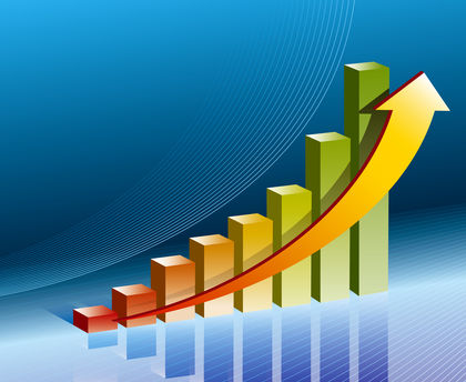
Many relationships are more complex than those that can be expressed as a linear relationship. For example, plants and animals tend to grow for at least part of their lives according to an exponential pattern. An equation that represents an exponential relationship is y = 2 x . As x gets larger, y also gets larger, but at a much faster rate. When x = 1, y = 2; when x = 2, y = 4; when x = 3, y = 9, and so on. The graph for this relationship is a curve that rises very rapidly.
Comment about this article, ask questions, or add new information about this topic: