Statistics

Statistics is that branch of mathematics devoted to the collection, compilation, display, and interpretation of numerical data. The term statistics actually has two quite different meanings. In one case, it can refer to any set of numbers that has been collected and then arranged in some format that makes them easy to read and understand. In the second case, the term refers to a variety of mathematical procedures used to determine what those data may mean, if anything.
An example of the first kind of statistic is the data on female African Americans in various age groups, shown in Table 1. The table summarizes some interesting information but does not, in and of itself, seem to have any particular meaning. An example of the second kind of statistic is the data collected during the test of a new drug, shown in Table 2. This table not only summarizes information collected in the experiment, but also, presumably, can be used to determine the effectiveness of the drug.
Populations and samples
Two fundamental concepts used in statistical analysis are population and sample. The term population refers to a complete set of individuals, objects, or events that belong to some category. For example, all of the players who are employed by major league baseball teams make up the population of professional major league baseball players. The term sample refers to some subset of a population that is representative of the total population. For example, one might go down the complete list of all major league baseball players and select every tenth name on the list. That subset of every tenth name would then make up a sample of all professional major league baseball players.
Words to Know
Deviation: The difference between any one measurement and the mean of the set of scores.
Histogram: A bar graph that shows the frequency distribution of a variable by means of solid bars without any space between them.
Mean: A measure of central tendency found by adding all the numbers in a set and dividing by the number of numbers.
Measure of central tendency: Average.
Measure of variability: A general term for any method of measuring the spread of measurements around some measure of central tendency.
Median: The middle value in a set of measurements when those measurements are arranged in sequence from least to greatest.
Mode: The value that occurs most frequently in any set of measurements.
Normal curve: A frequency distribution curve with a symmetrical, bellshaped appearance.
Population: A complete set of individuals, objects, or events that belong to some category.
Range: The difference between the largest and smallest numbers in a set of observations.
Sample: A subset of actual observations taken from any larger set of possible observations.
Samples are important in statistical studies because it is almost never possible to collect data from all members in a population. For example, suppose one would like to know how many professional baseball players are Republicans and how many are Democrats. One way to answer that question would be to ask that question of every professional baseball player. However, it might be difficult to get in touch with every player and to get every player to respond. The larger the population, the more difficult it is to get data from every member of the population.
Most statistical studies, therefore, select a sample of individuals from a population to interview. One could use, for example the every-tenth-name list mentioned above to collect data about the political parties to which baseball players belong. That approach would be easier and less expensive than contacting everyone in the population.
The problem with using samples, however, is to be certain that the members of the sample are typical of the members of the population as a whole. If someone decided to interview only those baseball players who live in New York City, for example, the sample would not be a good one. People who live in New York City may have very different political concerns than people who live in the rest of the country.
One of the most important problems in any statistical study, then, is to collect a fair sample from a population. That fair sample is called a random sample because it is arranged in such a way that everyone in the population has an equal chance of being selected. Statisticians have now developed a number of techniques for selecting random samples for their studies.
Displaying data
Once data have been collected on some particular subject, those data must be displayed in some format that makes it easy for readers to see and understand. Table 1 makes it very easy for anyone who wants to know the number of female African Americans in any particular age group.
In general, the most common methods for displaying data are tables and charts or graphs. One of the most common types of graphs used is the display of data as a histogram. A histogram is a bar graph in which each bar represents some particular variable, and the height of each bar represents the number of cases of that variable. For example, one could make a histogram of the information in Table 1 by drawing six bars, one representing each of the six age groups shown in the table. The height of each bar would correspond to the number of individuals in each age group. The bar farthest to the left, representing the age group 0 to 19, would be much higher than any other bar because there are more individuals in that age group than in any other. The bar second from the right would be the shortest because it represents the age group with the fewest numbers of individuals.
Another way to represent data is called a frequency distribution curve. Suppose that the data in Table 1 were arranged so that the number of female African Americans for every age were represented. The table would have to show the number of individuals 1 year of age, those 2 years of age, those 3 years of age, and so on to the oldest living female African American. One could also make a histogram of these data. But a more efficient way would be to draw a line graph with each point on the graph standing for the number of individuals of each age. Such a graph would be called a frequency distribution curve because it shows the frequency (number of cases) for each different category (age group, in this case).
Many phenomena produce distribution curves that have a very distinctive shape, high in the middle and sloping off to either side. These distribution curves are sometimes called "bell curves" because their shape resembles a bell. For example, suppose you record the average weight of 10,000 American 14-year-old boys. You would probably find that the majority of those boys had a weight of perhaps 130 pounds. A smaller number might have weights of 150 or 110 pounds, a still smaller number, weights of 170 or 90 pounds, and very few boys with weights of 190 or 70 pounds. The graph you get for this measurement probably has a peak at the center (around 130 pounds) with downward slopes on either side of the center. This graph would reflect a normal distribution of weights.
Table 1. Number of Female African Americans in Various Age Groups
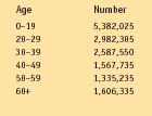
| Age | Number |
| 0–19 | 5,382,025 |
| 20–29 | 2,982,305 |
| 30–39 | 2,587,550 |
| 40–49 | 1,567,735 |
| 50–59 | 1,335,235 |
| 60+ | 1,606,335 |
Table 2. Statistics
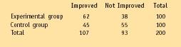
| Improved | Not Improved | Total | |
| Experimental group | 62 | 38 | 100 |
| Control group | 45 | 55 | 100 |
| Total | 107 | 93 | 200 |
Other phenomena do not exhibit normal distributions. At one time in the United States, the grades received by students in high school followed a normal distribution. The most common grade by far was a C, with fewer Bs and Ds, and fewer still As and Fs. In fact, grade distribution has for many years been used as an example of normal distribution.
Today, however, that situation has changed. The majority of grades received by students in high schools tend to be As and Bs, with fewer Cs, Ds and Fs. A distribution that is lopsided on one side or the other of the center of the graph is said to be a skewed distribution.
Measures of central tendency
Once a person has collected a mass of data, these data can be manipulated by a great variety of statistical techniques. Some of the most familiar of these techniques fall under the category of measures of central tendency. By measures of central tendency, we mean what the average of a set of data is. The problem is that the term average can have different meanings—mean, median, and mode among them.
In order to understand the differences of these three measures, consider a classroom consisting of only six students. A study of the six students shows that their family incomes are as follows: $20,000; $25,000; $20,000; $30,000; $27,500; and $150,000. What is the average income for the students in this classroom?
The measure of central tendency that most students learn in school is the mean. The mean for any set of numbers is found by adding all the numbers and dividing by the number of numbers. In this example, the mean would be equal to $20,000 + $25,000 + $20,000 + $30,000 + $27,500 + $150,000 ÷ 6 = $45,417.
But how much useful information does this answer give about the six students in the classroom? The mean that has been calculated ($45,417) is greater than the household income of five of the six students. Another way of calculating central tendency is known as the median. The median value of a set of measurements is the middle value when the measurements are arranged in order from least to greatest. When there are an even number of measurements, the median is half way between the middle two measurements. In the above example, the measurements can be rearranged from least to greatest: $20,000; $20,000; $25,000; $27,500; $30,000; $150,000. In this case, the middle two measurements are $25,000 and $27,500, and half way between them is $26,250, the median in this case. You can see that the median in this example gives a better view of the household incomes for the classroom than does the mean.
A third measure of central tendency is the mode. The mode is the value most frequently observed in a study. In the household income study, the mode is $20,000 since it is the value found most often in the study. Each measure of central tendency has certain advantages and disadvantages and is used, therefore, under certain special circumstances.
Measures of variability
Suppose that a teacher gave the same test four different times to two different classes and obtained the following results: Class 1: 80 percent, 80 percent, 80 percent, 80 percent, 80 percent; Class 2: 60 percent, 70 percent, 80 percent, 90 percent, 100 percent. If you calculate the mean for both sets of scores, you get the same answer: 80 percent. But the collection of scores from which this mean was obtained was very different in the two cases. The way that statisticians have of distinguishing cases such as this is known as measuring the variability of the sample. As with measures of central tendency, there are a number of ways of measuring the variability of a sample.
Probably the simplest method for measuring variability is to find the range of the sample, that is, the difference between the largest and smallest observation. The range of measurements in Class 1 is 0, and the range in class 2 is 40 percent. Simply knowing that fact gives a much better understanding of the data obtained from the two classes. In class 1, the mean was 80 percent, and the range was 0, but in class 2, the mean was 80 percent, and the range was 40 percent.
Other measures of variability are based on the difference between any one measurement and the mean of the set of scores. This measure is known as the deviation. As you can imagine, the greater the difference among measurements, the greater the variability. In the case of Class 2 above, the deviation for the first measurement is 20 percent (80 percent − 60 percent), and the deviation for the second measurement is 10 percent (80 percent − 70 percent).
Probably the most common measures of variability used by statisticians are called the variance and standard deviation. Variance is defined as the mean of the squared deviations of a set of measurements. Calculating the variance is a somewhat complicated task. One has to find each of the deviations in the set of measurements, square each one, add all the squares, and divide by the number of measurements. In the example above, the variance would be equal to [(20) 2 + (10) 2 + (0) 2 + (10) 2 + (20) 2 ] ÷ 5 = 200.
For a number of reasons, the variance is used less often in statistics than is the standard deviation. The standard deviation is the square root of the variance, in this case, √200 = 14.1. The standard deviation is useful because in any normal distribution, a large fraction of the measurements (about 68 percent) are located within one standard deviation of the mean. Another 27 percent (for a total of 95 percent of all measurements) lie within two standard deviations of the mean.
Other statistical tests
Many other kinds of statistical tests have been invented to find out the meaning of data. Look at the data presented in Table 2. Those data were collected in an experiment to see if a new kind of drug was effective in curing a disease. The people in the experimental group received the drug, while those in the control group received a placebo, a pill that looked like the drug but contained nothing more than starch. The table shows the number of people who got better ("Improved") and those who didn't ("Not Improved") in each group. Was the drug effective in curing the disease?
You might try to guess the answer to that question just by looking at the table. But is the 62 number in the Experimental Group really significantly greater than the 45 in the Control Group? Statisticians use the term significant to indicate that some result has occurred more often than might be expected purely on the basis of chance alone.
Statistical tests have been developed to answer this question mathematically. In this example, the test is based on the fact that each group was made up of 100 people. Purely on the basis of chance alone, then, one might expect 50 people in each group to get better and 50 not to get better. If the data show results different from that distribution, the results could have been caused by the new drug.
The mathematical problem, then, is to compare the 62 observed in the first cell with the 50 expected, the 38 observed in the second cell with the 50 expected, the 45 observed in the third cell with the 50 expected, and the 55 observed in the fourth cell with the 50 expected.
At first glance, it would appear that the new medication was at least partially successful since the number of those who took it and improved (62) was greater than the number who took it and did not improve (38). But a type of statistical test called a chi square test will give a more precise answer. The chi square test involves comparing the observed frequencies in Table 2 with a set of expected frequencies that can be calculated from the number of individuals taking the tests. The value of chi square calculated can then be compared to values in a table to see how likely the results were due to chance or to some real effect of the medication.
Another common technique used for analyzing numerical data is called the correlation coefficient. The correlation coefficient shows how closely two variables are related to each other. For example, many medical studies have attempted to determine the connection between smoking and lung cancer. The question is whether heavy smokers are more likely to develop lung cancer.
One way to do such studies is to measure the amount of smoking a person has done in her or his lifetime and compare the rate of lung cancer among those individuals. A mathematical formula allows the researcher to calculate the correlation coefficient between these two sets of data—rate of smoking and risk for lung cancer. That coefficient can range between 1.0, meaning the two are perfectly correlated, and −1.0, meaning the two have an inverse relationship (when one is high, the other is low).
The correlation test is a good example of the limitations of statistical analysis. Suppose that the correlation coefficient in the example above turned out to be 1.0. That number would mean that people who smoke the most are always the most likely to develop lung cancer. But what the correlation coefficient does not say is what the cause and effect relationship, if any, might be. It does not say that smoking causes cancer.
Chi square and correlation coefficient are only two of dozens of statistical tests now available for use by researchers. The specific kinds of data collected and the kinds of information a researcher wants to obtain from these data determine the specific test to be used.